In modern digital product development, keeping things consistent, visually and functionally, can feel like trying to juggle too many balls at once. As teams grow and products expand, it's surprisingly easy for designs to veer off course. One team might interpret a button style differently from another, or small inconsistencies in spacing and typography can pile up until they're impossible to ignore.
This can result in a fragmented user experience that feels disjointed and harder to scale.
This is where design systems come into play. At their core, they're a structured collection of reusable components, style guides, and principles that create a shared language for designers and developers alike. They serve as a blueprint, one that ensures your whole team is designing and building with the same vision in mind, no matter how many moving parts you're managing.
Standardization plays a big role here. A well-defined design system drives efficiency, cutting down on repetitive work and reducing miscommunication.
It's like having a single source of truth that makes collaboration easy, whether you're refining a new feature or prototyping a bold idea. For teams balancing complexity and speed, it's a major advantage, one that helps you focus on innovating instead of reinventing the wheel.
Design System Components
First, there's the style guide, Think of this as the DNA of your brand, it defines everything from colors and typography to spacing and interface rules, it makes sure every pixel aligns with your brand's identity so whether it's a website or an app, the design feels instantly recognizable.
Consistency here is aesthetic and builds trust.
Next, is the component library, which is a collection of reusable UI elements like buttons, modals, and dropdowns. These design assets come with code snippets and multiple states baked in, making life easier for both designers and developers.
Instead of reinventing the wheel every time, teams can simply drag, drop, and tweak.
Then, there's the pattern library, where components are grouped into layouts or templates. This is where the magic of efficiency happens. By combining individual pieces into pre-made structures, you eliminate guesswork.
This approach delivers faster iterations and ensures a polished, consistent look across every screen.
Documentation serves as the how-to manual that keeps everyone on the same page. From accessibility standards to editorial voice and UX best practices, clear documentation ensures your entire team can collaborate seamlessly, no matter their role.
Learn how to bring these parts together in our comprehensive guide to design systems.
These components create a system that's functional and scalable, making innovation easier and reducing friction at every turn.
Benefits of Using a Design System
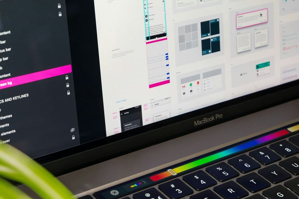
Design systems are like a cheat sheet for faster, smarter development. By standardizing components and guidelines, they streamline workflows and remove the guesswork from building digital products. Platforms like Figma offer comprehensive design features, from live collaboration to prototyping tools. Teams tap into prebuilt assets and spend their time solving the bigger, more complex challenges, rather than spending hours recreating buttons, dropdowns, or modals.
With design systems, the focus stays on refining the ride.
One major perk of design systems is consistency. A shared design language ensures that every screen, feature, or update feels cohesive. Whether it’s a quick tweak or a full rebrand, having a unified system in place makes those transitions smoother, and way less painful.
Your users notice that kind of polish, and it builds trust.
Then there’s the communication boost. A well-documented design system gets everyone on the same page, from designers to developers to new hires. It reduces those "Wait, what does this button do again?" moments and speeds up onboarding.
When everyone’s speaking the same language, collaboration just flows.
And let’s not forget scalability. As your product grows, so do the demands on your team. You can also leverage a customizable open-source UI component system to kickstart your design system. A solid design system acts as a foundation, letting you expand with intention and strategy when adding new features or testing ideas.
In the end, a design system serves as a framework for better decisions, faster execution, and a product that resonates deeply with users.
Challenges in Building a Design System
Building a design system is no small feat. It’s one of those projects that feels straightforward at first, until you’re knee-deep in decisions, resource allocation, and endless discussions about button styles. The challenges involve the work itself but also include aligning people, processes, and priorities.
For starters, there’s the significant initial investment. A proper design system requires time, money, and expertise. You’re creating components while also establishing a foundation for consistency across your product suite. That often means hiring specialized roles or pulling senior team members off other critical tasks.
Then there’s ongoing maintenance. A design system requires attention over time. It needs regular updates as your brand evolves and your user needs shift.
Without governance, it starts to lose relevance, and that’s when inconsistencies creep back in.
Training and adoption is another hurdle. Even the best system won’t work if your team doesn’t use it correctly. Whether it’s onboarding new hires or retraining existing staff, you’ve got to ensure everyone understands the why and how behind the system. Otherwise, you risk redundancy or downright misuse.
And let’s talk about flexibility. Not every project benefits from a design system, especially smaller or experimental builds. Forcing a rigid framework onto unique projects can feel like using a sledgehammer for a thumbtack, it’s overkill.
But the hardest part might just be stakeholder buy-in. Without support from leadership, allocating resources or enforcing adoption can become nearly impossible.
Add poor documentation, and you’ve got a recipe for confusion, misalignment, and wasted effort.
Great components alone don’t guarantee a successful design system. You also need buy-in, clarity, and a clear plan for keeping it alive.
Adopting and Managing Design Systems
Design systems vary widely in their fit for different organizations. Organizations must decide whether to adopt an existing framework, adapt one to their needs, or build something entirely proprietary. Learn more about these trade-offs in our guide to off-the-shelf and custom software solutions. Each approach has its strengths. Existing systems, like Material Design or Carbon, provide solid foundations and reduce upfront effort.
Adapting a framework lets teams tweak features while skipping a blank-slate start, building a proprietary design system? That's the ultimate in customization but requires significant time, resources, and long-term commitment.
Once implemented, managing a design system involves treating it like a living, breathing product instead of just maintaining static components. Think roadmaps, version control, and a focus on usability for internal teams. This matters because a design system is only as effective as its adoption rate.
Without clear documentation and usability in mind, even the best systems can fall apart.
Collaboration makes all the difference here. Successful design systems rely on cross-team alignment, where everyone, designers, developers, and important stakeholders, shares a common vision. Building this kind of "community ownership" ensures every update reflects real-world needs.
Equally important is feedback management. Establish channels to gather input, handle requests, and plan updates. This iterative approach keeps the system relevant as your organization evolves.
Without it, you risk your design system becoming outdated, a tool nobody wants to use.
In the end, a great design system keeps growing alongside your organization, adapts to new challenges, and empowers teams to innovate faster and with more confidence.
Creating Consistent Digital Experiences
To wrap it all up, design systems are powerful tools for creating consistent, scalable digital experiences. They align teams around a shared vision, streamline workflows, and eliminate inefficiencies that can bog down fast-moving organizations.
By operationalizing design with reusable components, clear documentation, and standardized guidelines, they ensure your products remain cohesive, no matter how complex or expansive your portfolio gets.
A design system requires ongoing investment, governance, and flexibility. Its success hinges on staying relevant and effective as it evolves alongside your business and user needs.
When done right, a design system acts as a catalyst for faster innovation, stronger collaboration, and better products.
If you're ready to build smarter, innovate faster, and test bold new ideas, start with a functional MVP.
Reach out to our team today, and let's turn your vision into a reality; quickly, efficiently, and without the headaches.